Thursday, December 4, 2008

Final Project: Final revisions


Final Revisions:

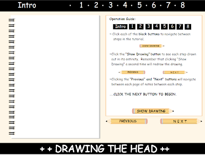
1) Each drawing is set to play automatically when the next step is reached. Each drawing can still be replayed with the "show drawing button."

2) The intro has been condensed into one page.  It has the same text as the three pages collectively had before, yet puts more emphasis on the actual steps while keeping the number of pages without drawings to a minimum.

3) The "show drawing" and "previous" buttons are now disabled on the first page.  They were not supposed to be clickable, and now the mouse does not prompt them to be clicked either.

Monday, December 1, 2008

Beta Revisions


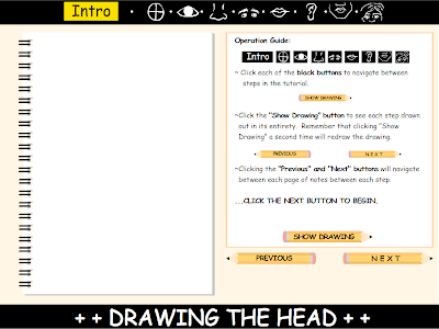
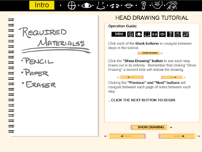
In this iteration of the final, the required materials for the tutorial are located on the first page.  I changed the font from Comic Sans MS to arial for its readability. The interface has been tweaked a little, now with the title of the tutorial, as well as each lesson in the upper right corner, above the text.  This way, the user is not forced to look in many different places for information. The lesson names have been simplified as well, indicating only which part of the face is drawn.  The buttons for navigating the pages have had their text replaced with arrows.  This way, fixing the kerning issue and simplifying the buttons themselves.  The "show drawing" button remains the same, albeit with different text, due to its specific function.

...Do my revisions make the interface more user friendly, and the program more effective in getting across it's information?

Tuesday, November 25, 2008

Final Project: BETA


To recap:  

One can navigate through different steps with the "next" and "previous" buttons.  Navigating to the beginning of each specific part of the face is done with the "black buttons" at the top of the program.  Clicking "show drawing" will draw out each step in the tutorial.  "Show drawing" can be clicked multiple times, at the user's discretion.

Revisions:

  • All animations done.
  • Changes to final drawings made. All drawings are now smoother and refined.
  • All interface buttons work.  Code has been put in so that the user can find his or her place in the tutorial regardless of how one navigates (the black guides above, or the prev. and next buttons.)

Comments:

When playtesting my project, and demoing it to its target audience, the common consensus among them was that having options to draw different sets of eyes, noses, and mouths would make the tutorial too complicated, and divide the material's subject matter up too much.  Because of this, I have omitted the option to see different facial features drawn, only keeping the options for creating multiple hair styles.

However, the program has been created in a way that the hairstyle chosen by the user, should they choose a hairstyle, is reflected in the final drawing at the end of the tutorial.

Thursday, November 20, 2008

Final Revisions


Current revisions:

Updated the user interface to indicate which step in the tutorial is currently being done.
Also enabled the buttons at the top to move to specific spots in the tutorial, indicated by that which is drawn in the step.

Wednesday, November 12, 2008

Proposal Edits:


Edit::

Clicking this link will take you to a runthrough of my program. NOTHING IS ANIMATED, yet you can see the final interface and read the actual tutorial.

Note: ONLY THE NEXT AND PREV buttons work. The "show drawing" button will draw each step when i finish it.

The operation guide gives an overview of each element of my program.
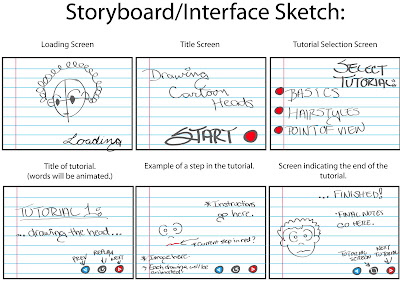


Due to the class critique Tuesday, I have reconsidered and revised a few of my ideas in my proposal.

Outside of school, I tutor middle school students in math and science. As I have grown to know them, I have discovered that many students at that age have a love for drawing and creation as well. Because of my status as an artist, many of my students want to learn some of the techniques that I have learned through my career. They want to learn the basics of drawing people in a simplistic, visually comprehensible method. Unfortunately, they have found many tutorial books to be largely the same and fail in producing images that are easy to follow. For my final project, I want to create an animated, interactive drawing manual for drawing heads. I originally wanted to do a full character, but there are books of information on drawing the head alone. This way, i can be more in-depth on a specific topic as opposed to resorting to a slew of generalizations.

The aesthetic will mirror the look of its target audience’s drawing materials; featuring a notebook paper background and mostly black and white drawings. ((Because other individuals may find the notebook paper aesthetic a bit distracting, i can include an option to change backgrounds. )) I want the interface to be easy to use, so each drawing and step-by-step guide will be navigated via point-and-click menus. Many of my students feel that they too often see a guide written that only shows the end result of each step, leaving the methods for arriving at the final drawing left in the dark. To alleviate this, each drawing step will be explained with text and animated illustrations. At the end of each tutorial, I want to include an option that lets the user customize the face that is drawn, incorporating different facial expressions. (I am still considering different styles of drawings as well, but that is currently tentative.) Clicking a feature brings up a slider menu that lets the individual choose an expression then see details on each style. I think that this will help my tutorial succeed where many fail, by providing actual video documentation of the “work” between each step.

I am not sure how many tutorials i will have in the final version, although i will have a maximum of 3, and if i do have more than one, each will slowly increase in difficulty.
Monday, November 10, 2008

Final Project Proposal

EDITS:

While talking to Dakoda, we discussed a few revisions to my plan that would make my final project stronger. The first is incorporating sound.  Sound effects such as a pencil scratching on paper, and possibly a soft looping track in the background would aid in engaging the user.  It would help to keep them entertained, as it is easy for children at that age to lose intrest.

He said it may be a good idea to incorporate a transparent grain or texture over a white background, instead of notebook paper, to simulate paper.  He also said to make sure my project is very intuitive, while maintaining a simple interface.


Outside of school, I tutor middle school students in math and science. As I have grown to know them, I have discovered that many students at that age have a love for drawing and creation as well. Because of my status as an artist, many of my students want to learn some of the techniques that I have learned through my career. They want to learn the basics of drawing people in a simplistic, visually comprehensible method. Unfortunately, they have found many tutorial books to be largely the same and fail in producing images that are easy to follow. For my final project, I want to create an animated, interactive drawing manual for cartoon characters.

The aesthetic will mirror the look of its target audience’s drawing materials; featuring a notebook paper background and mostly black and white drawings. I want the interface to be easy to use, so each drawing and step-by-step guide will be navigated via point-and-click menus. Many of my students feel that they too often see a guide written that only shows the end result of each step, leaving the methods for arriving at the final drawing left in the dark. To alleviate this, each drawing step will be explained with text and animated illustrations. I think that this will help my tutorial succeed where many fail, by providing actual video documentation of the “work” between each step.

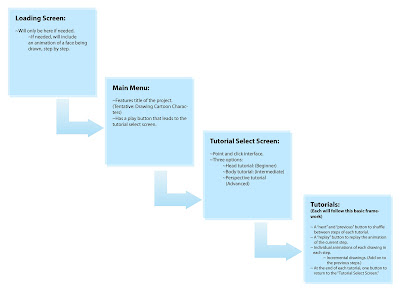
I currently want to have 3 tutorials that slowly increase in difficulty and use elements from the one before; one for drawing faces, another for drawing bodies, and one for drawing both in multiple perspectives.


Thursday, November 6, 2008

Drum Machine


Version 1.

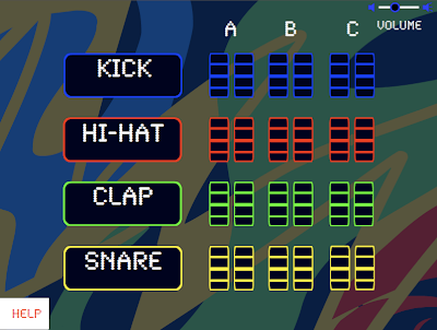
Each of the buttons for the different instruments is clickable. Once clicked, one of three musical patterns is played. There are 2 instances of each instrument a design choice i made to augment the current shortcomings my flash program has to fully fledged drum machine programs. Most basic beats created are from the same 4 instruments i've used here, but in those programs one benefits from having the program time beats for them, and match them up accordingly. I figured that my drum machine would function differently, throwing digital timing completely out the window, and letting the individual play with timing manually.

Sound is something that takes a while to get right, especially in a program such as this, where the options one gives the user in sound clips and repetition has to work together regardless of the combinations chosen. There are 2 copies of each clip just incase one would like to extend tracks, or try to get interesting effects by overlapping some. I've noticed that one can create some dynamic patterns by clicking multiple patterns of the same instrument.

For the color scheme of this, i decided to take a departure from my usual pastel preferences, and focused on something a bit basic, to reflect the drum machine's ease of use and current functions. Is this new scheme aesthetically pleasing? Or is it more of an eyesore? What about the functionality of the program? Do u see the benefit of letting individuals time their instruments manually? Or would you prefer a synchronization feature?

(Note: In retrospect, i notice that i could get more realistic combinations of music if I have volume sliders set to each individual instrument, as opposed to one master volume control.